Comments

Arthur Charles Clarke (1917-2008) is perhaps the most famous science fiction writer of all time. Those aren’t my words: I’m quoting off my 1990 paperback edition of Clarke’s Astounding Days: A Science Fiction Autobiography. With apologies to Messrs. Wells and Verne, that astonishing statement might even have been true at the time. In 1952, like Lord Byron, Clarke awoke to find himself famous, almost instantly propelled to the pinnacle of public fame.
Although his first two major stories had been published back-to-back in Astounding in April and May 1946, Clarke boasted only a handful of credits before 1952, most of them in second-tier magazines or even fanzines. At best he would be considered a rising young author, but he wasn’t young. Born in 1917, he was two years older than Frederik Pohl, three years older than Isaac Asimov. World War II had interrupted his career and so did a return to college to get his degree. He followed those Astounding stories with an attempt at a novel. As I relate in Prelude to Space, it would be rejected by everybody in the industry until it finally emerged into mostly ignored print in 1951.
A second novel, Sands of Mars, saw publication in England in late 1951. Marty Greenberg snapped it up, his first book to not have had a previous US publication. It appeared in April 1952 to utter silence. The first mention in a newspaper occurs on May 17, in a column merely listing new books at the library. It doesn’t rise to full review status until September. And then, the deluge.
What happened in between? Harper & Brothers, the huge and hugely prestigious publisher, released his non-fiction blockbuster The Exploration of Space in June, which had been hyped for months as the July selection of the Book-of-the-Month Club. The New York Times Book Review gave the book its entire front page, reviewed by Willy Ley and titled “Out of This World By Spaceship.”

Seemingly every other paper in America, as was and still is the norm, followed the Times’ lead. The Exploration of Space was everywhere, often paired with the suddenly discovered Sands of Mars, the convenient fictional interpretation of Clarke’s nonfiction vision. Science fiction was, for the briefest moment, as respectable as the classic poets and painters whose works were also reviewed in that TBR issue. It would not last, but Greenberg, for a change, had a certifiable hit on his hands.
Gnome Notes
Those stories were building Clarke a reputation as the quintessential hard science fiction writer and he was that then-exotic being – a Briton. With Prelude to Space buried as an obscure paperback, the British press treated this novel as a prestigious introduction into fiction for the “chairman of the British Interplanetary Society and a council member of the British Astronomical Association” when the UK firm of Sidgwick & Jackson published it as The Sands of Mars in November 1951.
Gnome left off the definite article and so did the first paperback edition, by Pocket Books in 1954, but seemingly all the later reprint publishers reverted to the original. The copyright page says it is a First Edition, which is legitimate, as Gnome’s is the first American edition and that’s standard for first American editions. The copyright date is given as 1952, the year of American publication.
The Gnome bibliography, however, is a mess and I’m going to make it worse.
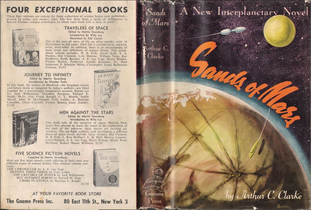
The first, 1952, printing was the then-standard 5000 copies. A review slip gives May 15 as the publication date, although Kirkus listed it as April 1. Clarke’s swiftly rising popularity forced Greenberg to print another 3000. CURREY doesn’t mention Gnome at all as it wasn’t the true first printing. ESHBACH and KEMP list two undated printings of 1500 copies each; CHALKER states that 3000 were printed in 1955, with half bound then and half later, in 1957. If ESHBACH is correct, this title is unusual in having three printings. As we’ll see there are reasons to think that three printings were indeed done. (I believe that Foundation also had three printings. See that page for details.) KEMP has no points for the second printing but writes that the third printing has “37 titles on back of dust jacket. Titling in yellow.” “Titling” seems to refer to the lettering on the boards, but I’ve seen none on any later variant that is yellow. A Science Fiction Book Club (SFBC) variant has yellow spine lettering, but that could never be confused with a Gnome release. (Or could it? See below.)
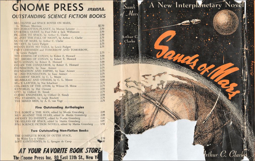
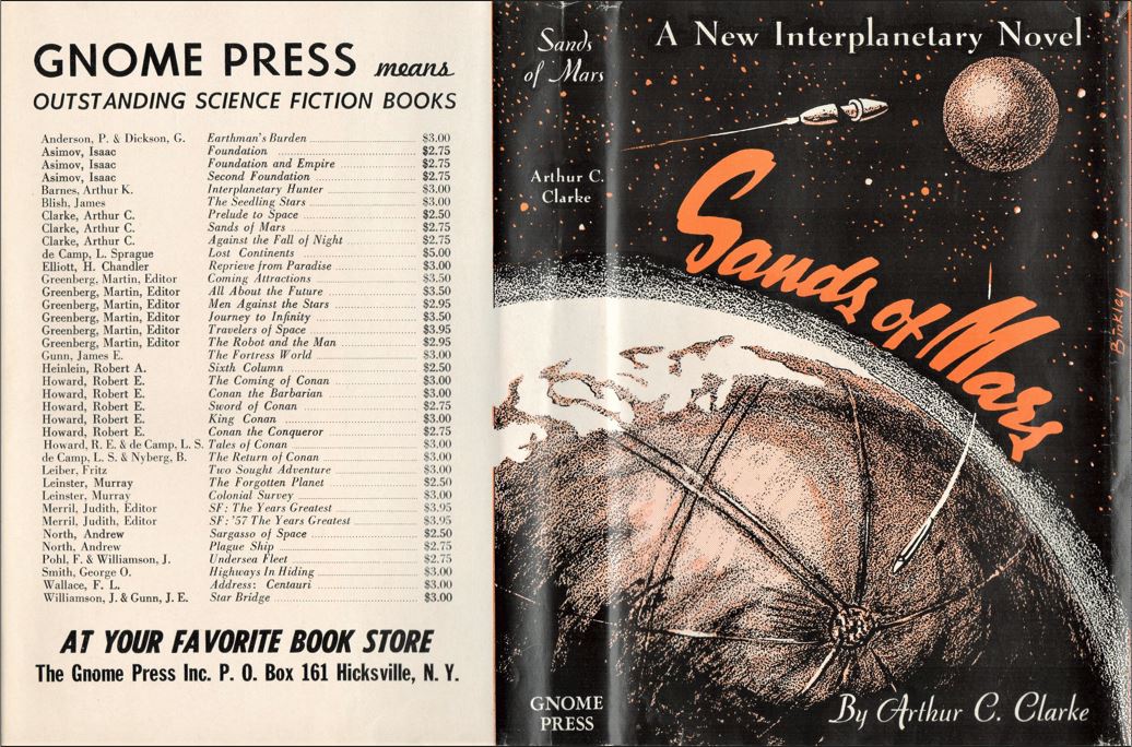
However, CHALKER is correct that a 37 title variant is known, with titles through mid-1957 on the back panel. The front covers of the original and new jackets are subtly different in concept but obviously distinct when placed side-by-side. Ric Binkley’s dense star field is reduced to a comparatively few dots; the planets gain a dot pattern; the font changes, and Binkley’s name moves from the bottom to the right side, so far right that it disappears around the fold. The flaps also differ. The front flap has indented paragraphs instead of justified type; the rear flap mentions only Clarke’s two other Gnome titles.
The books’ pages are nearly identical, with only one small revision. The tell is on the copyright page. The 1952 original references the by-then expected H. Wolff. The 1957 printing changes that to Noble Offset Printers, Inc. Only five other Gnomes were produced by Noble: the four Judith Merril best of the year anthologies that appeared in late 1956 and June of 1957, 1958, and 1959, and the 1961 reprinting of Gray Lensman. Seeing the Noble name in another 1957 title is odd, but may be tied to the 1957 Merril. Can anyone pretend to believe that taking the plates to different printer five years after publication results in a first edition? Yet that designation is retained. If the copyright page was changing anyway, why not simply make that change as well?
What of the supposed 1955 second printing? I thought that I’d never seen a copy. Nevertheless, I have a copy of a dust jacket with a 32 title back, identical to the one used on Lost Continents, The Forgotten Planet, and the 1954 Foundation second printing. That makes it almost certain that the printing took place in 1954, as the 32 titles list five of the eight books issued in 1954 and none from 1955. The Gnome address remains at 80 East 11th St. in New York rather than the Hicksville address of the 1957 covers. Why this should be so is yet another Gnome mystery.
Deepening the mystery is the book itself. I can argue incontrovertibly that the volume is a weird Gnome edition or that it is a weird SFBC edition. Let me lay out the cases.
First the look and feel of the book closely match the SFBC editions. It is much smaller and thinner than the first and third printings: 5.1″ w x 8.2″ h x 0.6″ d versus 5.6″ w x 8.2″ h x 0.9″ d. I have four variants of the SFBC editions, two are slightly taller than the other. The smaller ones are 5.4 ” w x 8.2 ” h x 0.8″ d. The larger two are 5.6″ w x 8.4″ h x 0.6″ d. The differences may be small, but an experienced hand would tell a Book Club printing from an original immediately.
The second difference would normally be inarguable. Both the printer and the FIRST EDITION line are completely left off the copyright page, making it identical to all four SFBC editions. Until recently I would have said that no Gnome reprint ever omitted stating the book was a first edition. That was until this weekend, when I bought the third printing of Foundation, which does exactly that, but several years later. Even so, those omissions should be definitive.
Yet that leaves the mystery of the dust jacket, which is sized for the Gnome Press first and third printings and so wraps awkwardly around the boards. The first letters of the titles on the back panel are completely cut off. The 32 titles cover books to the end of 1954 (although late ones are missing), increasingly the likelihood that the jacket was created for a 1955 release. (It was also used on two earlier 1954 books, but Greenberg had a habit of listing future titles on back panels.)
Although the book feels like an SFBC edition, the sizing is actually midway between a normal book club edition and a normal Gnome edition. Additionally, the lettering on the spine – Sands of Mars/Arthur C. Clarke/Gnome Press – runs vertically from the top to the bottom, meant to be read by turning the book 90⁰. The SFBC versions either have all the letters running horizontally in identical to the Gnome versions, and in the same font, or just the title words running vertically. Therefore, this spine belongs to neither.
What may be the clincher is the otherwise inexplicable second printing of Asimov’s Foundation. The printing is given as 1954 by CHALKER, which would match the back panel – because the back panel is identical to this Sands. The small size of the book is also identical to this Sands. The cover is therefore too large for the boards, cutting off the first letters of the titles on the back panel – identical to this Sands. The spine lettering runs vertically down the page – identical to this Sands. Few would dispute that these two books were conceived of, created, and printed at the same time.
Yet, maddeningly, the Foundation printing keeps the full copyright page, including the printer and the all-important first printing designation. Why would anyone keep the copyright page for one and not the other? Inexplicable does not begin to cover the mystery.
What in the end sways me is that this is no longer a unique volume that can be tossed off as someone’s chimera. I’ve seen photos of a second identical Sands, complete with the oversized cover. That, plus the realization that the second printing of Foundation appears to have been done at the same time in identical boards and identical oversized cover, leaves little doubt that both were issued by Gnome. I’m amending my bibliography to reflect that.
Three variants, one of them previously unknown, would seem to be sufficient variety for any one title. Yet the bottomless resources of the Internet keep tossing up unrecorded variants of Gnome titles. Amazingly, not just one but two additional variant boards have been found for Sands: green boards with black lettering and gray cloth with red lettering. Both of them came with the 37-title dust jacket; both of them have the Noble Offset copyright page. They unquestionably came from the 1957 printing, although there is no reason that additional copies couldn’t have been bound at some later time. In fact, evidence suggests this might be true. At least a half dozen Gnome titles have later variant bindings of gray cloth, all lettered in red, from 1959 on. Methuselah’s Children, Tros of Samothrace, and SF: ’59 have later green boards bindings, lettered in black. Methuselah’s has both gray and green. None of these variants changed the dust jacket, so the use of a 1957 back panel is not conclusive proof of that year.
However, the green binding has significantly different paper stock than the other two variants, thicker, courser, and more prone to darkening than the other two. A different paper stock cannot be part of a binding. This appears to be a totally unexpected fourth printing. Unfortunately, no other differences give any indication of a date.

Unlike Clarke’s other two Gnome books, Sands would remain on back panels through to the end; continual binding of warehoused copies or even new printings might have been needed to keep up with demand. New evidence has a dismaying tendency to confound Gnome mysteries rather than solve them.
Review(s)
Noah Gordon, Avon Science Fiction and Fantasy Reader, January 1953
More important than the story itself is the documentary style of the writing. The long journey to Mars is described so convincingly that the reader is tempted to rush out and book passage on the next space-liner. And Clarke’s conception of the red planet is foreign enough to be exotic yet reasonable enough to be thoroughly believable.
Unsigned, Beckley [VW] Post Herald, September 15, 1952
It is soundly, not wildly imaginative, and the reader is certain to be left with a profound impression: this is a story of tomorrow which the author, with complete believability, has brought to life today.
Contents and Original Publication(s)
• Chapters 1-17, London: Sidgwick & Jackson, 1951.
Bibliographic Information
Sands of Mars, by Arthur C. Clarke, 1952, copyright registration 15Apr52, Library of Congress Catalog Card Number not given [retroactively 52-10185], title #21, back panels #20,27,39, 216 pages, $2.75. 5000 copies printed, 1952; 1500 copies printed, 1954; 1500 copies printed, 1957; possible additional printing of unknown date. Hardback. Jacket design by Ric Binkley.
Variants, priority of 1957 bindings not known
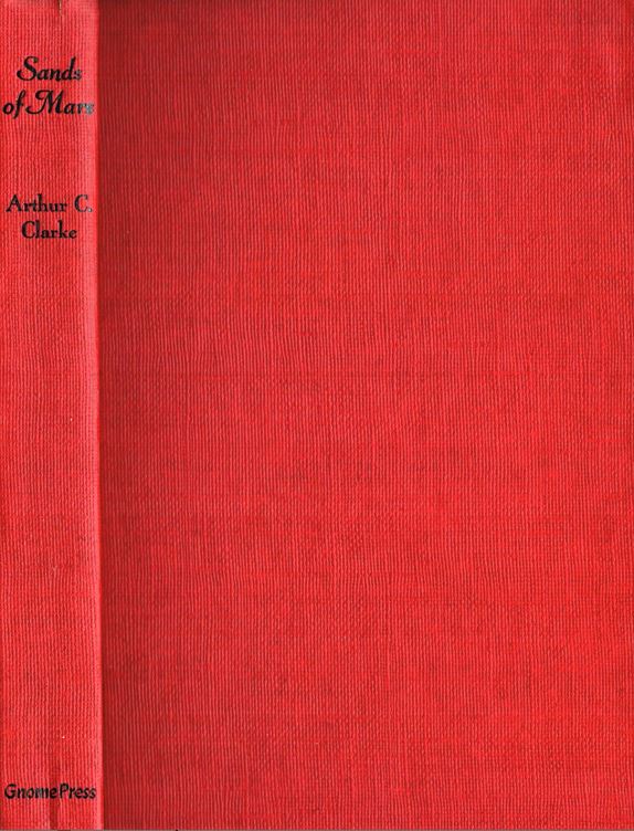
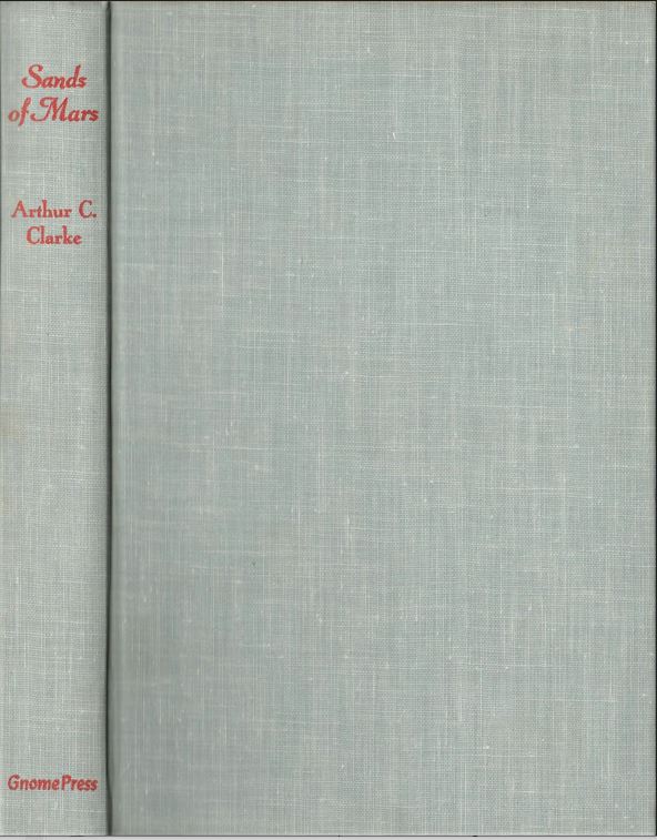
1) Dark red boards, spine lettered in black, printed 1952. Dust jacket, front cover: dense star field, smooth planets, Binkley signature at bottom; rear flap: 18 titles. FIRST EDITION and Manufactured in the U.S.A. by H. Wolff, New York. Back panel: 4 titles; Gnome Press address given as 80 East 11th St., New York 3.
2) Black boards, spine lettered in red, printed 1954. Physically smaller than 1) or 3) at 5.1″ w x 8.2″ h x 0.6″ d. Dust jacket: front cover: sparse star field, mottled planets, Binkley signature vertically up right edge; rear flap: Two More Great Books by Arthur C. Clarke. FIRST EDITION and printer designation missing from copyright page. Back panel: 32 titles, Gnome Press address given as 80 East 11th St., New York 3.
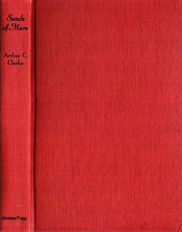
3) Dark red boards, spine lettered in black, printed 1957. Dust jacket: front cover: sparse star field, mottled planets, Binkley signature vertically up right edge; rear flap: Two More Great Books by Arthur C. Clarke. FIRST EDITION and Manufactured in the U.S.A. by Noble Offset Printers, Inc. Back panel: 37 titles, Gnome Press address given as P. O. Box 161 Hicksville, N.Y.
4) Gray cloth, spine lettered in red, printed 1957. Dust jacket: front cover: sparse star field, mottled planets, Binkley signature vertically up right edge; rear flap: Two More Great Books by Arthur C. Clarke. FIRST EDITION and Manufactured in the U.S.A. by Noble Offset Printers, Inc. Back panel: 37 titles, Gnome Press address given as P. O. Box 161 Hicksville, N.Y.
5) Green boards, spine lettered in black, Different paper from 1957 bindings, new printing of unknown date? Dust jacket: front cover: sparse star field, mottled planets, Binkley signature vertically up right edge; rear flap: Two More Great Books by Arthur C. Clarke. FIRST EDITION and Manufactured in the U.S.A. by Noble Offset Printers, Inc. Back panel: 37 titles, Gnome Press address given as P. O. Box 161 Hicksville, N.Y.
True first edition
London: Sidgwick & Jackson, 1951.
Images