
 Comments
George Oliver Smith (1911-1981) claimed that he started writing fiction when he inherited a typewriter in 1942 and that he spent “some time spilling a lot of words on wasted paper before writing something that I liked.” Considering that he broke into print in October 1942, his apprenticeship couldn’t have lasted all that long.
One could, in what we loftily recall as “the good old days,” get along with a flair for style, a talent for scribbling readable dialog, and a wide splattering of scientific knowledge; compounded by an ability to argue in sheer sophistry with a straight face – the “what would happen if…” game that made a lot of us regular contributors to the John W. Campbell school of science fiction.
He broke into that school with “QRM – Interplanetary,” the first of a dozen “Venus Equilateral” stories, in Astounding’s October 1942 issue. QRM, appropriately, is amateur radio code for “I have interference.” Smith would continue writing in that vein with an additional thirty Astounding stories (some published under the name Wesley Long) over the next five years, abruptly stopping in the October 1947 issue, after which Smith appeared in lesser magazines for a decade.
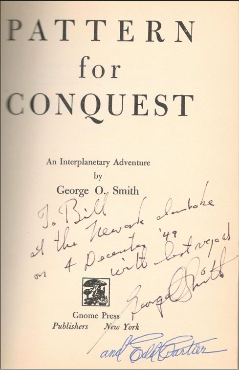
One of many factors that may account for this is the smallness of the f&sf community of the era. Doña Campbell, wife of Astounding’s Campbell, left her husband John in 1949 to live with Smith. He was someone she had seen in 1945, during a separation from John in 1945 because of a depression after the birth of their second daughter, Leslyn, named after Robert Heinlein’s wife. George and Doña were married for 25 years, until her death. Although their affair did not start until 1949, strains in the Campbell marriage had been building for all those years. They moved in together after they and much of the New York crowd had relocated to the spacious shores of New Jersey, lured by amenities like Fletcher Pratt’s 30-room house/writer’s salon. I wonder if the copy below was signed at one of the mammoth gatherings of the in-crowd.
Gnome Notes
Pattern for Conquest was the fourth title and first true science fiction book that Gnome published.

— cover at by William Timmins
The argument over whether fantasy and science fiction are part of the same genre, two distinctly separate genres, or opposite sides of the same coin spans the entire existence of science fiction as an identifiable genre. The pulps regularly ran fantasies alongside proto-science fiction stories in the early part of the century. Weird Tales and Unknown featured names who could as easily be found in science fiction magazines. H. P. Lovecraft’s “The Color Out of Space” first appeared in Hugo Gernsback’s Amazing Stories. New Collector’s Group, Prime Press, and Shasta Publishers all started their lines with fantasy books. Fantasy Press, however, was all science fiction. Greenberg would have seen it as completely natural to start with books by well-known names who happened to be writing fantasy, even if they were exploring widely disparate ends of that spectrum.
Readers looked at the field differently. Fantasy was in one of its periodic declines, while science fiction had boomed in the post-atomic world. The Carnelian Cube sold out of its first small printing but Frank Owen’s Porcelain Magician hardly sold at all. P. Schuyler Miller said in his review of Pattern that “Another publisher reports that unabashed space opera is the surest seller in the science-fiction field today.” Greenberg certainly heard the same gossip as Miller, but books have to be purchased and put into production long before sales figures for previous titles can come in and we know that he had a stack of titles in inventory. Whether by fortune or design he hit on the perfect book to give his faltering line a boost. Look at this flap copy:
Jumping forward in time several hundred years, the reader finds himself in a future where space travel is commonplace. Spaceships of mankind crisscross from planet to planet, carrying civilization out of our Solar System to the stars beyond. Alien people are encountered on strange worlds and fascinating situations are experienced. Vast fleets of spaceships clash in battle.
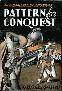
Fascinating situations are experienced. Doesn’t that grab you by the ears? It ain’t easy, but if you ignore that giant flat tire, the rest of the car is beautiful. Spaceships. Aliens. Space battles. The future, or really, the Future! Edd Cartier, who was also producing art for Gnome’s calendars at the same time, drew a throwback 30s cover of two barechested futuremen – in shorts that would embarrass a superhero – who who are pulling blasters out of their holsters to stage a show-down in front of an uncircumcised phallic spaceship. This was Gnome’s first cover to scream Science Fiction. It would get confiscated if you dared sneak a peek at it in English class, but that was a feature for readers at the time.
Another alien? futureman? stares out at the reader from the spine. The orange and black Halloweeny colors are broken by a blob of white containing the word “CONQUEST.” As with almost everything at Gnome, this comes with a story. Cartier got so carried away with his art that he accidentally spelled Conquest without the “s”. Kyle had to paste the proper spelling back in, and for some reason changing the background made it look better.
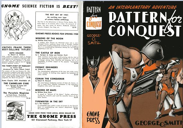
 But it’s the rear cover that tells the best story of all, at least to historians looking back at Gnome. To emphasize that Gnome published science fiction, right under the banner headline GNOME SCIENCE FICTION IS BEST! a comically large-eared alien in a transparent bubble space helmet is pictured reading a book that is labeled GNOME PRESS SCIENCE FICTION on its rear cover. Aliens apparently read right to left, as in Hebrew or Arabic. The Elf under the toadstool official logo is smaller and at the bottom of the page. Half the titles on the page are still fantasy, though. From now through the end of Gnome’s run science fiction subsumed fantasy as the label for what the press published.
Gnome’s back covers were advertising for the press, not for the author. That seems somewhat odd to us today, either because we associate back covers with blurbs and promotion of the author or because we question why all publishers don’t do something so obviously useful. Take a look at this page of Robert Heinlein covers, though. A pattern immediately emerges. The science fiction small presses used the covers to promote themselves; the major, mainstream publishers like Scribner’s and Doubleday promoted Heinlein. They could afford to. They knew that any books they published would find their way into all the bookstores of the country almost automatically. The small sf presses had no such luxury and needed readers to make an effort to reach out to them. Small wonder that the bottom of the cover reads “ORDER NOW FROM YOUR LOCAL BOOK DEALER OR THE GNOME PRESS“. (The address listed, 421 Claremont Parkway, New York 57, was Greenberg’s own house in The Bronx.) Distribution was the bête noire of small presses. No specialty science fiction bookstores existed. If the books were to be seen, bookstores had to know about them, order them, and receive them. All were huge tasks for firms with one or two employees, made more urgent by the ever-growing piles of books sitting in the office, or the warehouse, or at the printers. Dozens, maybe hundreds, of bookstore orders had to be processed promptly and properly, with all the follow-up paperwork for sales, payments, re-orders, demands for payments, shipments, returns, and threats on both sides eating up every spare moment. All for books that were a small slice of a tiny niche of a sideline to the regular book industry.
Gnome would continue to use almost every one of its back covers as advertisements for itself, to paraphrase Mailer, but none of them are as deep with story and intrigue and archaeological significance as Pattern for Conquest. It’s a treasure chest as wonderful as any pirate’s and far more real.
Pattern was one of the four trade paperbacks Gnome released. (see The Trade Paperbacks) CURREY states it was done in 1952, but I know of no other evidence for that.
Reviews
August Derleth, Madison Capital Times, February 24, 1950.
This is typical interplanetary fiction fare, neither better nor worse than average.
Frederik Pohl, Super Science Stories, March 1950.
This novel has everything – dramatic adventures in interstellar space, glittering intrigue with alien races, and touches of genuine humor.
Contents and Original Publication
- Chapters 1-24 (Astounding Science Fiction, March 1946, April 1946, and May 1946).
Bibliographic information
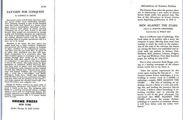
Pattern for Conquest, by George O. Smith, 1949, copyright registration 16Nov49, Library of Congress Catalog Card Number not given [retroactively 50-3818], title #4, back panel #4, 252 pages, $2.50. 5000 copies printed, 3000? bound as hardback 1949; unknown number of trade paperback copies printed, 1952?. Jacket design by Edd Cartier. “FIRST EDITION” on copyright page. Manufactured in the United States of America. Title page, jacket, and copyright registration add “An Interplanetary Adventure.” Back panel: 10 titles plus “The Best Buy of 1950″ untitled. Gnome Press address given as 421 Claremont Parkway, New York 57.
Variants, in order of priority
1) Hardback, light orange cloth, spine lettered in red.
2) Trade paperback, front cover identical to hardback dust jacket, back cover is blank white. Spine reads PATTERN FOR CONQUEST by George O. Smith in black lettering on white background. Stated “FIRST EDITION” but is later issue.
Images
 — Pattern for Conquest, orange cloth, red lettering, variant 1
 — Pattern for Conquest, trade paperback, variant 2