Comments
John W. Campbell reigned over the world of science fiction through the force of his personality, his ability to take the bare bones of an idea and exhort his writers to adopt his vision for magnifying its potential, his lofty peak as the editor of the magazine every writer wanted to sell to, and his vision of science as the creator of an unlimited future wonderland that would span the universe, a future that his writers fervently bought into. Only Robert A. Heinlein, the oldest and most mature of his new discoveries, could stand up to the tsunami of talk by which Campbell drowned their objections. The much callower Asimov, ever the dutiful straight-A student, took these commands as homework and molded his thinking to Campbell’s.
In a January 1945 meeting, Campbell announced that his next step would be to overturn Seldon’s plan. “I was horrified,” Asimov wrote in his memoirs. “No, I said, no, no, no. But Campbell said: Yes, yes, yes, yes, and I knew I wasn’t going to sell him a no, no.” Asimov thereupon threw an unexpected wrench into his works, the Mule, a mutant with mind-control who defeats the Foundation because Seldon had no plan for him.
Campbell and Asimov thought this merely a clever plot twist. In retrospect, we can see that it marks the beginning of a new age in the field. Between the time Asimov started writing the story and the time it was published, the atomic bomb changed the world irrevocably. The coming Future would not be seen as a scientific utopia. Nor would the unexpected arise to foil plans only once every thousand years. Every year – every day – would present a mutant no one could predict. Campbell never truly recovered from this. In half a decade, Mule-like, he had conquered the field of f&sf. By the time Empire was published, Campbell’s empire had been dethroned by the editors of Galaxy and F&SF magazines, determined to put the fiction in science fiction the equal of the science. Marty Greenberg was a Campbellian at heart. He would continue to pick the bones of Astounding until the end, publishing merely one serial from Galaxy and ignoring F&SF entirely. He was obsolete even before he peaked.
Gnome Notes
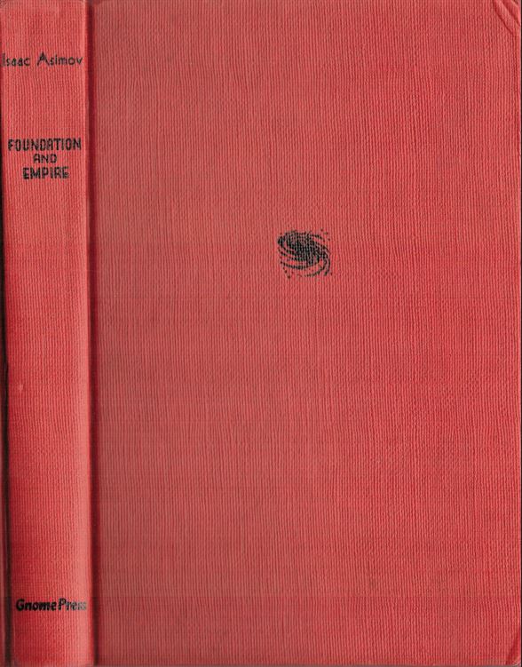
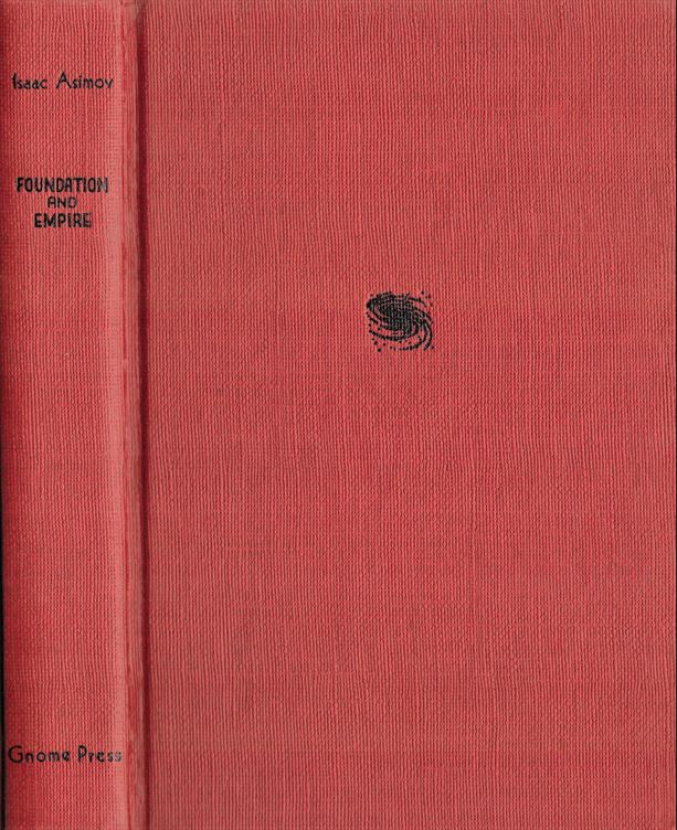
Greenberg printed 5000 copies of Empire in 1952. CURREY lists two states for the dust jacket: “(A) printed in four colors; 26 titles listed on rear panel. (B) printed in blue and black only; 32 titles listed on rear panel.” CHALKER lists three states of the boards: the original 1952 red boards, a fatter red boards, and a 1955 green boards. CURREY agrees that there are three boards, with the original 22 cm (0.9”) but adds that the green boards are also fatter at 28 cm (1.1”), and notes that the both the green and red fat boards are equally fat. Not terribly complicated for Gnome: the original is thin and has a full-color dust jacket with 26 titles on the back panel; the later boards are fatter and have a two-color jacket with 32 titles.
But this is Gnome, and it’s never that simple.
My copy of the green boards sports a blue-black jacket with 36 titles.
Finding an unrecorded variant of a Foundation trilogy dust jacket should give any collector a thrill, and this one has unique flaws which make it a doozy. Yet dealers have known for decades that a 1955 green second printing existed; all should have known better than to pair a 1961-era dust jacket with the book. Double yet, there are indeed green board variants bearing the 1961 dust jacket: at least I’ve seen them for sale online. Triple yet, the 36 titles on my copy’s jacket list every book issued in 1956.
Something is weirdly off.
Let’s sort through the mess point by point. Visuals will make it easier.
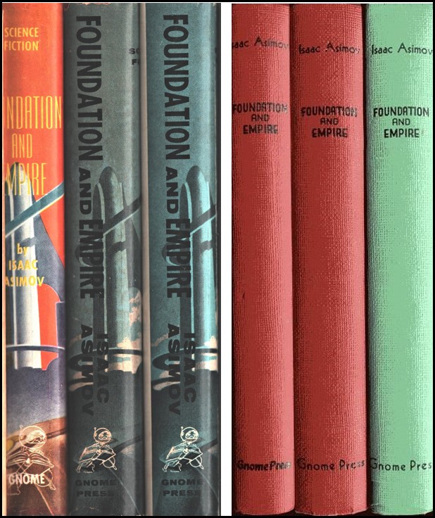
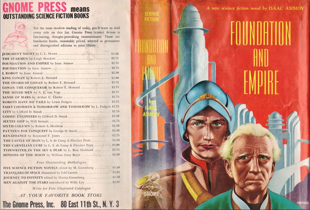
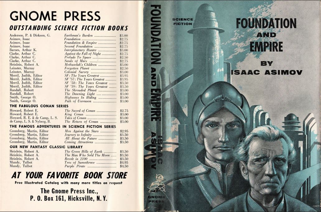
The boards’ contrast is easy to see when put next to one another this way, although if handled separately there are no obvious differences without measuring the thickness and the size of the Gnome Press imprint. The spines on the dust jackets are immediately discernible; they look like two different books. In addition to the red and yellow lettering, the first edition’s spine has the words “SCIENCE FICTION” at top and it along with the title and author are printed horizontally. The blue and black reprint spine leaves off “SCIENCE FICTION” and has the title and author printed vertically. The Gnome spaceman at the bottom of the first edition spine has the word “GNOME” beneath; the second edition reads “GNOME PRESS.”
The jacket covers also have changes, almost as dramatic.
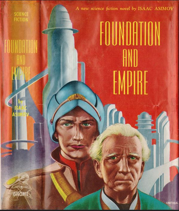

“A new science fiction novel by ISAAC ASIMOV” runs horizontally along the top of the first edition cover, with “FOUNDATION AND EMPIRE” on three lines below. The second printing cover shifted the illustration 0.4” to the right, opening up space to fit in the words “SCIENCE FICTION” that had been on the first edition spine. “A new science fiction novel by” is missing. “FOUNDATION AND EMPIRE BY ISAAC ASIMOV,” printed horizontally, fills in the space. Edd Cartier’s signature “CARTIER” appears in full on the lower right corner of the first edition cover. On the 36-title second printing only “CA” is visible, which the rest folded around the boards. On the 32-title second printing “CARTI” is visible, with the rest folded around the boards.
Clouds appear behind the words, where a blank red background had been on the first edition. Some shadowing appears in the older man’s white hair and elsewhere. I actually prefer the new version – the garish colors on the original appear flat and superficial compared to the stylish gradations of the blue/black shading – and I wonder why so much work went into the changes if the purpose was merely to save money.
As with Foundation, Greenberg graced the first state with thin paper of fairly good quality, meaning that it hasn’t browned as much over the years. The second printing used paper that was cheaper, thicker, and has browned badly over time.
The gap in time between the green boards and the fat red boards raises an unanswerable question: are the fat red boards a rebinding or a true third printing? Although the paper seems similar in size and quality, the red boards’ page edges show bands of alternating dark and light signatures that the green boards utterly lack. Weighing against the idea of a new printing is the reality that Greenberg was barely functioning by the end of 1960; binding pages sitting in warehouses costing him money for storage was sensible – printing new complete books was not. The argument for was at least as compelling: not having all three books of the trilogy to sell was unthinkable. Gnome’s existence soon foundered under dilemmas such as these. Death was less than two years away. The 32-title back panel on the fat red boards also appeared on Frederik Pohl’s Drunkard’s Walk and John W. Campbell’s Invaders from the Infinite, books number 83 and 84 out of 86. (see The Back Panels) Both books appear to have been released in the Spring of 1961. Book number 82, Edward E. Smith’s The Vortex Blaster, is copyright in June 1960; book number 85, Smith’s Gray Lensman, didn’t appear until at least Fall 1961. That gives a year’s leeway for the fat red boards. Any time in that interval is possible. Inexplicably, despite a known release of Empire in that period, none of the trilogy was mentioned on books number 85 or 86. As for the green board variant wearing the 32-title dust jacket, several scenarios can be speculated. Leftover unbound copies of the second printing could have been bound in green and then red. Unsold bound books could have had the newer, more appropriate dust wrapper substituted. Somebody later on could have swapped a nicer jacket for a missing or tattered old one.
One thing we can be sure of: CHALKER must obviously be wrong. No 1955 printing could possibly be issued with a listing of back panel books running through 1957. But this is Gnome. Obviously is a word that must be thrown out of the critical vocabulary.
Gnome released seven titles in 1955. All of them except James Gunn’s This Fortress World, from October, shared the same back panel. Although Gnome from its chaotic inception had a bad habit of announcing titles ahead of publication, this was the first time that an entire year’s forthcoming output was treated as if it had been already published. Bookstores must have been annoyed by people asking for books that didn’t yet exist, but perhaps Greenberg profited by getting checks for advance orders to ease his already dire cash flow problems.
Whatever the reasoning, Greenberg must have approved because he did the same thing in 1956. All five books issued that year shared the same back panel featuring all five books. And in 1957, the first three books shared a new back panel listing those three titles.
Empire’s back panel has the identical book listing to the books released in 1956, down to the egregious typo of Robert “E.” Heinlein. That allows for Empire’s back panel to have been printed in 1955. However, back panels include more than a listing of books. The top of back panels since 1954 ran the bold black slogan “GNOME PRESS means/outstanding science fiction books”. Three lines after the book listing read AT YOUR FAVORITE BOOK STORE/Free Illustrated Catalog on Request/The Gnome Press Inc. 80 East 11th St., New York 3”. Starting in 1957 a fourth line was added – “OUTSTANDING SCIENCE FICTION BOOKS” with that weird gap between SCIENCE and FICTION and a smaller gap between the T and A in Outstanding. My guess is that the reduction from 36 titles to 32 titles left too much empty space. Something had to fill it. Why repeat a line already used in a different font that was awkwardly pasted in? Unknown.
It gets worse. For an extreme and unbelievable screw-up, few Gnome mistakes can beat Empire. The fourth line there read “FICTION BOOKS OUTSTANDING SCIENCE”. Ludicrous but true.
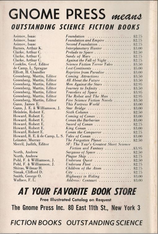
Not even Gnome could allow a mistake of that magnitude in large bold type to be repeated on another title. (As for Heinlein’s middle initial, his entry was “corrected” by being eliminated on the next set of panels.) The conclusion must be that the 36-title variant was printed sometime between Undersea Fleet, copyright September 1, 1956, and Coming Attractions, copyright March 15, 1957. (Yes, I therefore believe that CHALKER is wrong, although not obviously so.)
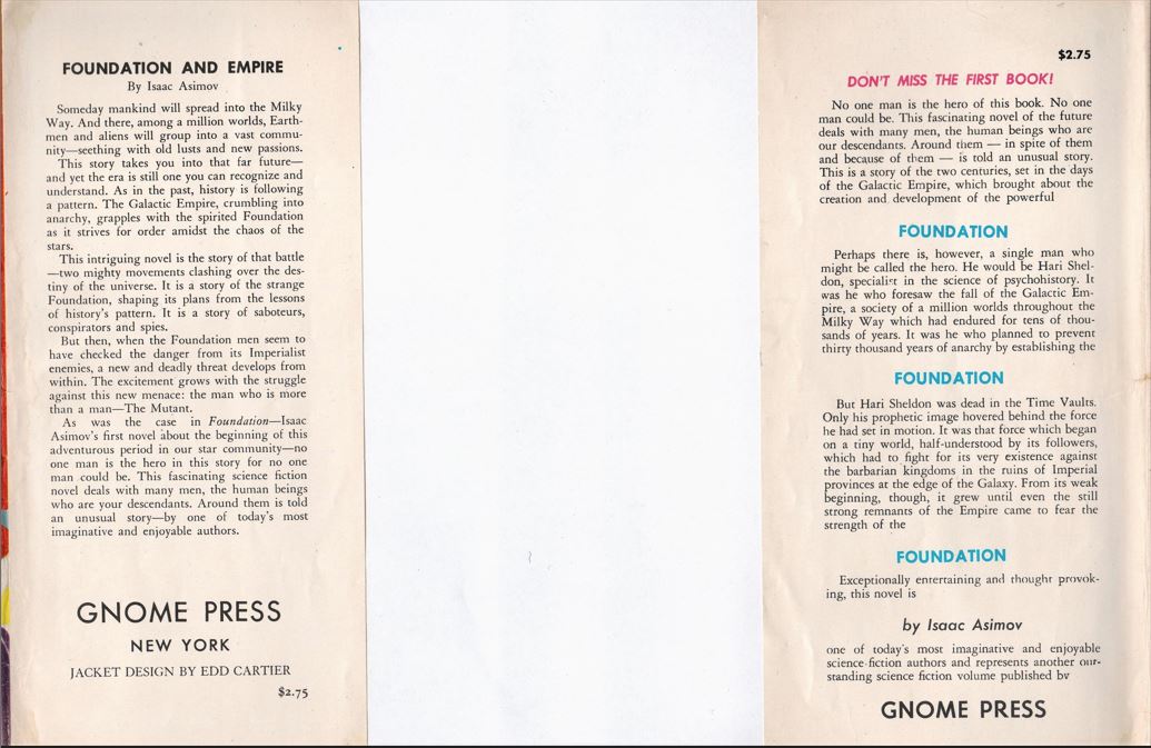
Smaller mistakes had an infinite lifespan. On the rear flap of the first edition, Hari Seldon’s name again – again – got misspelled as Hari Sheldon, just as it had been on the front flap of Foundation. This rear flap remained uncorrected on the two reprint dust jackets. There are no words, although I’m sure Asimov thought of a few.
Reviews
J. Francis McComas, New York Times Book Review November 23, 1952
The story, unfortunately, is humorless and heavy-handed, much too much for the endurance of any but the stoutest reader.
Groff Conklin, Galaxy Science Fiction, January 1953
Asimov takes his galactic civilizations up (and down) much the same culture steps that our own Earth society has trod, and this gives his imaginative romance a very solid, social-scientific air.
Contents and original publication
• “Prologue” (original to this volume).
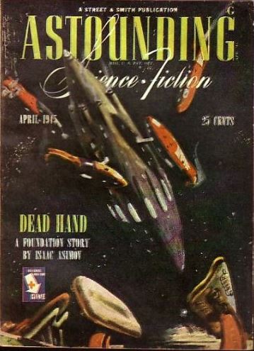
• “The General” (Astounding Science Fiction, April 1945 as “Dead Hand”).
• “The Mule” (Astounding Science Fiction, November and December 1945).
Bibliographic Information
Foundation and Empire, by Isaac Asimov, 1951, copyright registration 15Sep52, Library of Congress Catalog Card Number not given [retroactively 52-12466], title #28, back panel #21,32,39, 247 pages, $2.75. 5000 copies printed, 1951; 2500 copies printed, 1956?, unknown number bound 1961?. Dust jacket design by Edd Cartier. “FIRST EDITION” on copyright page. Designer: David Kyle. Printer: H. Wolff. Manufactured in the U.S.A.
Variants, in order of priority
1) (CURREY A1A) Hardback, red boards, spine lettered in black, 1951. “Gnome Press” on spine measures 0.9” wide, sheets bulk 0.8”. Four-color dust jacket, background in plain red, “SCIENCE FICTION” on top of spine, GNOME imprint at bottom, “A new science fiction novel by” on cover, front flap has GNOME PRESS/NEW YORK. Back panel: 26 titles. Gnome Press address given as 80 East 11th Street, N. Y. 3.
2) (CURREY C2x) Hardback, green boards, spine lettered in black, second printing 1956?. “Gnome Press” on spine measures 1.1” wide, sheets bulk 0.9”. Dust jacket printed in blue and black only, GNOME PRESS imprint on spine, cover background includes clouds, “SCIENCE FICTION” on upper left of cover, front flap has GNOME PRESS/NEW YORK. Back panel: 36 titles. Gnome Press address given as 80 East 11th Street, New York 3. “FICTION BOOKS OUTSTANDING SCIENCE” at base. (cover variant not in CURREY).
3) (CURREY C2B) Hardback, green boards, spine lettered in black, release unknown. “Gnome Press” on spine measures 1.1” wide, sheets bulk 0.9”. Dust jacket printed in blue and black only, GNOME PRESS imprint on spine, cover background includes clouds, “SCIENCE FICTION” on upper left of cover, front flap has GNOME PRESS/P. O. Box 161, HICKSVILLE, NEW YORK. Back panel: 32 titles. Gnome Press address given as 80 East 11th Street, New York 3. (not seen)
4) (CURREY B2B) Hardback, red boards, spine lettered in black, 1961?. “Gnome Press” on spine measures 1.1” wide, sheets bulk 0.9”. Dust jacket printed in blue and black only, GNOME PRESS imprint on spine, cover background includes clouds, “SCIENCE FICTION” on upper left of cover, front flap has “GNOME PRESS/P. O. Box 161/HICKSVILLE, NEW YORK”. Back panel: 32 titles. Gnome Press address given as P. O. Box 161, Hicksville, N.Y.
Images