Comments
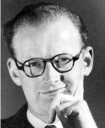
After Clarke’s breakout year of 1952, anything with Clarke’s name on it was suddenly a valuable commodity. Unfortunately, unlike so many of the other Golden Age writers, who had been piling up magazine content for a decade or so, Clarke’s backlist was virtually barren. The only story of substance was “Against the Fall of Night,” which had appeared as a “complete novel” in the November 1948 Startling Stories. A poetic fable of the far future, the story could not have appeared in Astounding, and was lucky to find publication anywhere in the post-war period. Sam Merwin, Jr., in Fantastic Universe, claimed that “It seems probable that the delay in its publication … was caused by the fear of its publisher that the dreaminess of its atmosphere, which is the basis of much of its charm, would be miserably misunderstood in an era of hard-cover science fiction devoted to BEMs and bang-bang space opera.” Such simple charm made it suitable for Young Adult shelves in libraries. Berta Nash, in the St. Louis Post-Dispatch, wrote that “The youthfulness of the hero and the uncomplicated nature of the story make a novel which is well suited to the younger science-fiction fan.” Clarke, whose skills improved quickly and markedly, was himself dissatisfied with the work, rewriting and expanding the novel so it could be published in 1956 as The City and the Stars. That fared even worse. Another Post-Dispatch writer, Scott Nichols, dismissed the redo as “a first faltering effort” with an immature basic plot.
The title is taken from “Smooth Between Sea And Land” by A. E. Housman. “Here on the level sand, between the sea and land, what shall I do or write against the fall of night?'”
Gnome Notes
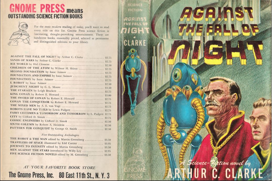
Coming in at less than 45,000 words, the work had to be finessed to give the appearance of a full-length novel. (The length is at the boundary of a novel and novella, although Clarke apparently did consider Against as his first novel.) Greenberg used conspicuously large type and started the text numbering with page 11 so that it appears to justify its 223-page length. More insidiously, he added blank pages so that each chapter break has two or three pages with no words except the chapter title. A full 46 pages are added this way, more than a fifth of the book. Contrast that with, say, Iceworld, a book of exactly the same bulk. The text there starts on page 1, the type is smaller, and each page contains six more lines, while chapters are not larded with blank pages. Readers therefore received 216 pages of actual verbiage and over 70,000 words. Yet such is the power of a name that Greenberg charged $2.75 for the Clarke and $2.50 for the Clement. (The covers for the books portray oddly similar blue-suited aliens with ribbed arms for flexibility, the work of two entirely different artists. Additionally, both used boys as foils for the aliens, which probably made them more attractive for libraries.)

Reviews
Groff Conklin, Galaxy Science Fiction, December 1953
It is a light, simple, fast-moving and often richly imaginative fantasy, a very pleasant time-passer indeed.
P. Schuyler Miller, Astounding Science Fiction, November 1953
For the simple fascination which this kind of science fiction can bring, “Against the Fall of Night” is recommended.
Contents and Original Publications
• “Prologue” (original to this volume).
• Chapters 1-18 (Startling Stories, November 1948).
Bibliographic Information
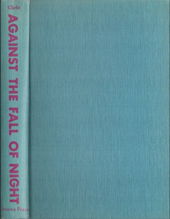
Against the Fall of Night, by Arthur C. Clarke, 1953, copyright registration 15Apr53, Library of Congress Catalog Card Number not given [retroactively 53-9537], title #31, back panel #23, 223 pages, $2.75. 5000 copies printed. Hardback, blue boards, spine lettered in red. Jacket Design by Frank Kelly Frease [typo for Freas]. “FIRST EDITION” on copyright page. Printed in the U.S.A. by H. Wolff. Back panel: 25 titles. Gnome Press address given as 80 East 11th Street, New York 3.
Variants
None known.
Images